Recently, I released Further — Automattic’s first premium magazine theme. I’ve been given a chance to write about my thoughts behind its inspiration, design, and development. I hope this gives you something to think about as you design your next WordPress theme or website.
 I designed Further for professional publishers who want to build authority and an audience with a content-rich website. Their posts are in-depth, and they use advertising to pay for the costs of publishing. You might ask, “Why does Further have such a specific audience?” or “Can’t anyone use this theme?” Sure, anyone can use Further. But I’d rather create amazing themes for a specific purpose than multi-purpose themes that are just good. In my experience, I’ve found that WordPress themes designed for a specific purpose perform better when people use them for that purpose.
Main features
- Responsive Layout (of course): Further looks and works great on smaller screens, such as tablets and smartphones, as well as on laptops and desktops.
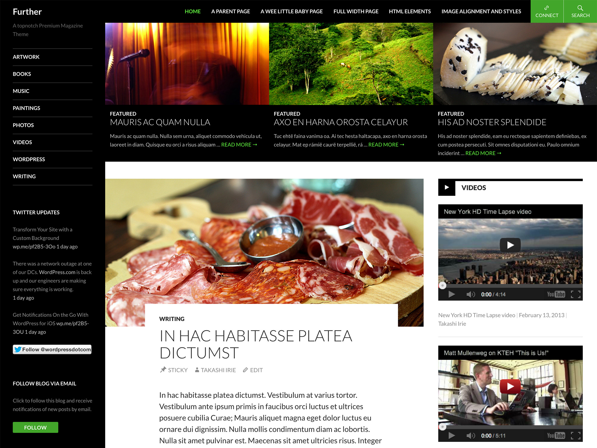
- Featured Content Area: At the top of the front page, Further displays a maximum of six featured posts. (this requires the latest version of Jetpack if you are using it for a self-hosted WordPress blog)
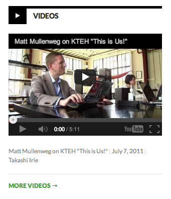
- Further supports the Standard, Video, Image, Gallery, Aside, and Quote formats are supported.
- Post Format Feed: On the front page, the theme displays the latest two posts from each format in the right sidebar.
- Fixed header on screens wider than 770px.
- Social “Connect” Area: Optional links to your profiles on Twitter, Facebook, Pinterest, Google+, LinkedIn, Flickr, GitHub, Dribbble, YouTube, and Vimeo in the header.
- Seven Widget Areas.
- Two Custom Menu locations, flexible height Custom Header, and Custom Background.
- Full-width Page Template
Things that I think could be improved in current magazine themes out there
Magazine themes have been popular for years and there are many great themes available, but typical magazine themes tend to share some issues… at least from my point of view…
1. Featured content sliders with huge images 😦
This sort of slider is great for a portfolio site showcasing photos and products, but I don’t see it as the best option for a content-heavy site. When I have a moment to visit a fast-paced news site, I don’t want to wait for the huge slider to loop through every item and see if something interesting comes up. Do you? And yes, I know that sliders often provide navigations and thumbnails but unfortunately, they don’t still make me spend time clicking through them all in hopes that I might find something interesting in there. I prefer to skim the site quickly to find stories I want to read.
Don’t get me wrong, I see the value of a featured content area. It allows editors to highlight articles they feel are important. I like it, but not with huge images and fancy transitions (except maybe for image-centric online magazines).
For Further, I chose a grid format to display a maximum of six featured posts. They are sufficiently set apart visually from the rest of the articles and help to see what’s featured at a glance. And it’s simple!

2. Too many options to get a site running 😦
Another common issue in many magazine themes is that they tend to have a large number of options required in order to get a site running. One of the common questions I’ve seen with magazine themes is something along the lines of: “My homepage doesn’t look like the demo site. Help!”. We hear this often from users of themes that require them to publish a page with a specific page template (to supply front page specific elements such as a featured content area), and then set it as the front page in Reading Settings. For theme developers like you, it might sound simple, but you would be surprised to learn how many users get confused about this.
One day, one of my teammates, Michael Fields, brought up the idea of using front-page.php to reduce this sort of confusion. As you can see in the template hierarchy in the Codex, front-page.php will always be used for the front page, regardless of whether it displays latest posts or a static page. This means users wouldn’t need to choose a specific page template for the front page. This is a neat idea and works great for a theme like Further. We haven’t heard the front page question from users… yet 🙂
Another typical example of magazine theme options is the “what, where, and how many to display” kind of setting. Instead of this approach, Further displays the latest two posts from each supported format in the right sidebar of the front page.
Yes, there are limitations with this implementation, but it’s part of an effort to minimize theme options and user confusion. From the Customizer, you can add a link to your email, as well as links to your profiles on major social media services in the header. This option is crucial for professional publishers nowadays, but it’s the only theme option Further uses, and it’s totally optional. There are no mandatory settings that users have to go through to get their sites up and running, just activate it and it works.
Another teammate of mine, Philip Arthur Moore, said:
“I wonder how many “normal” computer users start a program and never even look in the preferences page. It’s like, they open the program and that’s what they get… It makes me think themes out of the box should just work and theme options should be viewed like preferences sometimes… Food for thought.”
This is a great point and I really love this idea for WordPress themes. I’m glad to see that some theme developers are cutting down on the number of theme options lately, but we can make it even better.
3. Body text line length that’s too long 😦
Readability is crucial for a content-heavy site, especially in regards to the body text, and many magazine themes could do better. It seems to vary depending on research but my personal rule of thumb is that 55 – 75 characters per line, including space is best for legibility purposes. If you ever need to count characters or words, you’ll find this bookmarklet handy. An even greater challenge is making sure that we give optimum settings for line length and line height in responsive themes.
I chose Lato as the typeface family for Further because I wanted to use a typeface that has a bit of character in larger sizes, such as for headings, but can also be transparent and neutral when it’s used in body text for better readability. Lato is designed by Warsaw-based designer Łukasz Dziedzic. It’s described as follows:
“The semi-rounded details of the letters give Lato a feeling of warmth, while the strong structure provides stability and seriousness.”
Lato is absolutely beautiful and a great fit for a magazine theme for professional publishers.
Other design decisions
- I used Genericons for post meta info such as date, sticky posts, and author instead of the traditional sentence format (eg. This entry was posted in ____ on ____ by ____.). This structure makes sense in English, but if I translate it to Japanese, it ends up being a lengthy sentence that’s hard to translate into something that flows well. There’s a good chance that translators from other languages will run into these challenges. That’s why I’d rather use icons — their meanings are universal.
- Spaces for ads: As mentioned earlier, ads can be important elements on a site to pay for the production. In Further, the max width for the right sidebar is 306px, which is wide enough to house a Mid Page Unit (300px wide, 250px high) and the left sidebar is 168px wide where users can put a widesky (160px wide, 600px high).
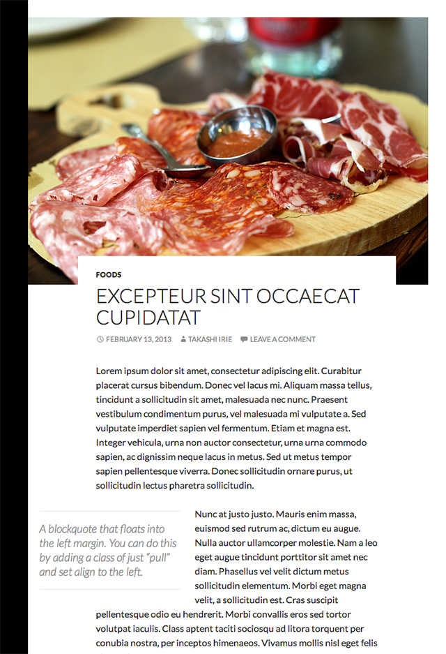
- Featured Images: The featured image of an article should grab the reader’s attention. For standard format posts without a featured image, the theme displays a patterned placeholder. Placeholder use is debatable, but the idea is to encourage editors to add a featured image to support the article. In Further a featured image that is at least 672px wide will work best.
- Fixed header: On screens wider than 770px, the header (which contains a navigation area, search, and social media buttons) remains fixed at the top of the page as the user scrolls. This way, the user can access the menu at anytime without having to scroll back to the top and leave their current place in your content.
- Pull quotes: On screens wider than 1150px, editors can take advantage of pull quotes. By adding a simple class of
pullto a blockquote that is either left- or right-aligned, the quote floats into the margin accordingly. It’s a small visual treatment, yes, but it makes articles more dynamic and draws attention to key points.
I could go on, but those are the main points where I put more emphasis on improving, with the goal of providing the best solution for our users and their visitors.
I devoted a great amount of attention and thought to the details in Further, but it’s far from perfect yet. Over time, I will continue to iterate on this theme to make it even better.

20 responses
Congrats… it’s a really a great theme!
Not enough comments on this post! Its great to read a developer’s take on their theme. Its so easy to get lost in theme design, sometimes you do just need to break down what other people are doing and make it better for the user.
Well done.
Nice rational, Takashi, this is the first time I’ve read a theme creators reasons why they built the theme the way they did, love it.
When are you coming back to Winnipeg?
I’d skip the
pullclass on pullquotes. I’d argue you should simply incorporate the WordPressalignleftandalignrightclasses. Just give the pullquote treatment to any blockquote with one of those classes. It’s one less class to worry about and uses standard classes from WP.Please feel free to open a ticket for Twenty Fourteen!
[…] It is a “magazine theme”, and its creator, Takashi Irie, wrote about the design process at the Automattic Theme Team’s blog. […]
[…] column, and the 4-5 widget footer. Further was originally developed by Takashi Irie. Check out his behind the scenes post on how the design came to be. Also, take a look around the ThemeShaper website as it was redesigned […]
[…] Takashi Irie, the theme’s author, explains some of the motivations behind its development here. That’s Takashi personal take. Before this theme is released, it will go through some […]
[…] Irie, the theme’s author, explains some of the motivations behind its development here. That’s Takashi personal take. Before this theme is released, it will go through some revisions […]
[…] releasing the theme earlier this year, Irie posted his thoughts on the design at […]
Great explanations Irie.
I like the idea of reducing theme options and completly agreed with what Philip Arthur Moore said.
There are about 4 months before this theme will be released as default Twenty Fourteen theme and I believe that are few areas could be improved.
How do you set the featured posts at the top of the home page?
Twenty Fourteen is not really ready for use yet as we’ve just kicked off the 3.8 dev cycle. We’ll be posting progress http://make.wordpress.org/core/tag/twentyfourteen/ to keep you updated.
[…] on the complexity of the theme, a launch could take anywhere from one week to four weeks. So for Further — which is now the base of Twenty Fourteen — Takashi spent a lot of time coming up with the […]
Can’t find it at Creative Market.
Hi Connie,
Further is not available anymore. It will be the new default theme, TwentyFourteen, for WordPress 3.8: http://takashiirie.com/wordpress/further-becomes-twenty-fourteen.html
I see. Must wait for it then. 🙂
[…] can learn many of the initial design considerations by Takashi Irie on his post on Theme Shaper where he describes designing Further / Twenty […]
Hello,
Is it possible to somehow get the “Connect” button from Further onto the Twenty-Fourteen theme?
Thank you!
That would be something you’d need to custom-code into a child theme. You can ask for help in the Twenty Fourteen forum:
http://wordpress.org/support/theme/twentyfourteen