Icon fonts are a truly great hack. They’re lightweight, scalable, and a clever way to use vector-based images on the web at a time when SVG just doesn’t have enough popular browser support to be practical. Despite starting out life as a hack, icon fonts are like the sprites of vector graphics, and I think they’re here to stay.
Enter Genericons, a new icon font made especially for blogs by Joen Asmussen with contributions from Sheri Bigelow and Takashi Irie. They were designed with simplicity in mind to keep a minimal, “generic” aesthetic so they can be used in a wide range of projects. They look sharp at small sizes because each icon has been aligned to on a 16×16 pixel grid.

The font name itself puts emphasis on the word “generic,” but Genericon is both an anime/science fiction/gaming convention in upstate NY as well as cannon fodder for Decepticons. I think you’ll agree that’s pretty fantastic as far as namesakes go.
Genericons began as indicators inside the notifications feature on WordPress.com. Word got out about the font-based icons, and soon there were requests to use them for post formats in WordPress themes, support tools, and various other projects. And so, they were wrapped up into a 100% free, GPL-licensed font. You’ll even see them baked into the newest default WordPress theme, Twenty Thirteen, which is currently under development.

Making an icon font is a labor of love. It involves a meticulous eye for detail and the skill to scale down a concept like “asides” into one tiny symbol. Genericons has gotten a lot of love. All of the icons were carefully aligned to a 16×16 grid. Each symbol is mapped to the Private Use Area of Unicode to avoid being read out by screen readers. Much inspiration was taken from Github and their glorious “The Making of Octicons” article. The bulletproof @font-face syntax used was graciously generated by Font Squirrel (we love those guys). The OpenType font file (.otf) is even included so you can can drop it in your system fonts folder and use the font in Photoshop if you like.
Icon fonts are awesome because you can easily change their size, color, opacity, shadows, rotation, outline, or add gradients/textures (although you lose scalability if you do that last one). The flexibility you get from being able to use CSS to change the way they look, like re-coloring all the icons with one simple rule, makes them superior to SVG for this use case. They also work in all modern browsers, and they can even have transparent knockouts that work in IE6.
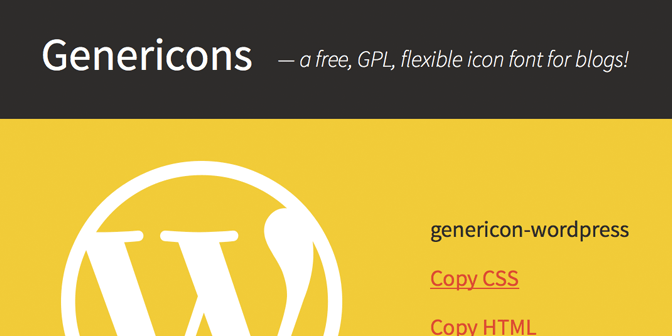
To give Genericons a try, go to http://genericons.com/ and download the font. Copy the genericons folder into your project (make sure to remove any example.html or other unnecessary files). Link the CSS in your HTML:
<link href="path/to/genericons.css" rel="stylesheet">
Then try out the following CSS examples that will change icon color in one fell swoop, swap standard bulleted lists with the checkmark icon, or style your blockquotes to make them stand out.
Turn every icon a Salmon color:
.genericon {
        color: #fa8072;
}
Or turn the stars Gold:
.genericon-star {
        color: #fa8072;
}
Use icons for bulleted lists:
<ul class="my-checklist">
        <li>One</li>
        <li>Two</li>
        <li>Three</li>
        <li>Four</li>
</ul>
.my-checklist {
        list-style-type: none;
        text-indent: -16px;
}
.my-checklist li:before {
        padding-right: 16px;
        content: 'f418';
        display: inline-block;
        -webkit-font-smoothing: antialiased;
        font: normal 16px/1 'Genericons';
        vertical-align: text-top;
}
Use icons to style blockquotes:
<blockquote class="my-blockquote">Sometimes I've believed as many as six impossible things before breakfast. —<em>Lewis Carroll</em></blockquote>
.my-blockquote {
        background: #eee;
        border-left: 32px solid #ddd;
        padding: 10px;
}
.my-blockquote:before {
        margin-left: -42px;
        padding-right: 10px;
        content: 'f106';
        display: inline-block;
        -webkit-font-smoothing: antialiased;
        font: normal 32px/20px 'Genericons';
        vertical-align: bottom;
}
I hope you find Genericons as much fun to use as I do!

15 responses
Any thought to adding a version number to this? If new icons are added to the font in the future it would be nice to be able to easily check against a version number.
Great suggestion. We’ll look at adding a version number to the next update.
[…] details are in The Genericons Icon Font Story announcement post. In additional to being a nice general use icon font, it is licensed under GPLv2 […]
I love where this is going. Are the source files anywhere that people can create new ones and submit?
Thanks! We haven’t made any plans to release the source files as of yet, but that’s a cool idea. Does your question mean you are interested in contributing to Genericons?
I absolutely love this. Great timing and fantastic job!
I find Genericons to be a great replacement for other icon fonts like Font Awesome, Iconic etc. It would be really great if some more icons are added.
This is just the beginning! More icons will be added.
[…] The Genericons Icon Font Story. A slick GPL-licensed icon font produced by the ever awesome Joen, Sheri, and Takashi. […]
Perfect timing. I finally put the final touches on my new site and saved the footer for last of course. I used genericons and they look amazing.
Thanks so much for these.
The font is great!
Could you please add a Flattr icon, though?
I’m helping with a website for a non-profit and Flattr integration is quite important to us.
Thanks for the suggestion. Can’t promise anything right away, but we’ll keep it in mind when we add updates in the future.
The code for the buttons doesn’t work in Genesis. Any idea on why?
I really can’t say without more information, and I’m not very familiar with Genesis. Try hitting up the forums for help getting more specific debugging info as a starting point.
Genericons is one of the best thing I’ve ever seen 🙂 It saves lots of time and the design is awesome