
If you’ve read my previous articles you’ll recognize the title of this post. For those of you who are new, these are my thoughts behind the themes I’ve designed. This time, I’d like to talk about Forefront — a responsive Business theme.
- Demo
- Activate it for your WordPress.com site
- Download from Creative Market for your self-hosted WordPress site
MAIN FEATURES
- Custom page templates
- Jetpack testimonials ready
- Jetpack Social Links ready
- Flexible widget areas
- Support for flexible Custom Header, and a Custom Background
- Responsive design
- Accessible tab-able navigation
Custom Page Templates
More often than not, for a business or an organization, websites are more sites than blogs. What I mean by that is that pages are more important than posts that are only used for news items or press releases in what are often called brochure sites.
For that reason, I’ve included three extra page templates for this theme–Front Page, Grid Page, and Full Width.
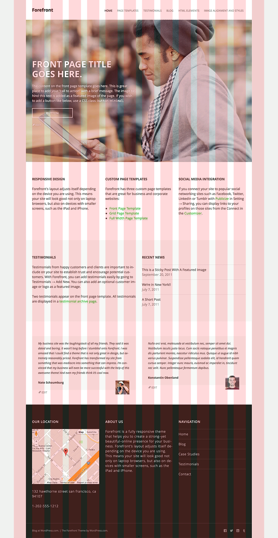
1. Front Page Template

As the name suggests, this template is perfect for the front page and it will turn a blog into a site. The page title and the content can be used as a “call to action” that sits on a featured image which is typically an image of a service or a product. This powerful combination helps visitors act on their designed desired action.
What does every “call to action” need? Yes, a button! Forefront has two custom CSS classes that turn a link into a button: button, and button-minimal.
For example,
<a class="button" href="http://yourgroovydomain.com">Button</a>
this makes a link look this:

<a class="button-minimal" href="http://yourgroovydomain.com">Button</a>
And this makes a link look this:

Why custom CSS classes? What about shortcodes? We’ve seen so many themes that provide shortcodes for buttons but that’s a bad move. Justin Tadlock summarized the issue and it’s a must-read if you’re a theme designer.
Below the call to action or hero area, there are two optional widget areas. Since the width of each widget is dynamic depending on the number of widgets in each area, it’ll always look great.
Below the widget areas, the template displays randomly chosen two testimonials. I’ll get to testimonials in a minute. 🙂
2. Grid Page Template

Another typical need for a business site is a page that showcases services, case studies, or team members. The Grid Page Template is designed for that. It displays its child pages with their featured images, titles, and excerpts. Using page hierarchy is much easier and intuitive for site owners than custom page meta or anything else.
3. Full Width Page Template

Lastly, a full width, no sidebar page is handy when you choose to embed a map or even a showreel.
Testimonials
Testimonials from happy customers are important to include on a business site to establish trust and encourage potential customers.
Forefront uses a custom post type, Testimonials which is available for Jetpack powered sites. It provides an intuitive way for users to input testimonials. And they’re portable between themes that support the testimonial post type with Jetpack.
Making your theme support the testimonial CPT is as easy as adding support for post thumbnails.
function theme_name_testimonial() {
	add_theme_support( 'jetpack-testimonial' );
}
add_action( 'after_setup_theme', theme_name_testimonial );
The only thing left is to create an archive template for the CPT, archive-jetpack-testimonial.php. Of course, you can display them anywhere in the template with a query. We’ll publish a small tutorial for the CPT here soon.
Social Links
Forefront is ready to take advantage of the Social Links module in Jetpack. The module lets you choose profile links for your theme’s social media integration from selected services connected to the Publicize setting.
OTHER DESIGN DECISIONS
Grid
I’ve designed Forefront with the grid that comprises 60px columns and 30px gutters. I took the Frameless approach by Joni Korpi — just like Ryu — so that all elements on a page remain in balanced proportion on all screen sizes.
Typeface
For this theme, I chose a popular humanist sans-serif typeface family, Open Sans. It’s designed by Steve Matteson who also designed the popular typeface, Droid Sans. Not only does the typeface supports extensive character sets, it has a wide variety of weights. This allows fine-tuned typography on the theme.
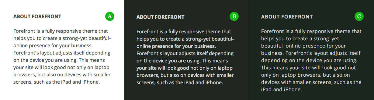
See the screenshot of a text widget above (click to enlarge). Between A and B, for the heading and the paragraph, each type setting is exactly the same. The only difference between the two is that A has a light background, B has a dark background used in the footer widget area. Despite having the same settings, individual letters, especially the heading , are fuzzier and they appear to be too close to each other on the dark background. This is so-called halation effect impairs the legibility of the text. The effect will vary depending on your screen but chances are most of people are not using HiDPI screen yet.
The wide variety of weights comes handy here. To reduce the effect, I decreased font weight for each and increased letter spacing. As you can see in C, letters are much clearer and crisp. A simple rule of thumb is that light color text on dark background needs to be wider apart and lighter in weight than the opposite.
Color Palette
![]()
I chose green for links and buttons for Forefront. In general, green can represent wealth, growth, renewal, and stability. I thought it was a great choice for a business site. Other than that green, the rest of the colors used are shades of grey but they all have a hint of green so that the whole page looks less dull. Following Ian Storm Taylor’s advice, the amount of green I added was proportional to the darkness of the grey. So in Photoshop’s color picker, the color pallet looks like this:

Overlapped Featured Image
Much like I did with Further and Twenty Fourteen, I made a blog post overlap with a featured image with a negative offset in Forefront too. It’s a simple idea but it creates visual tension and it enhances the connectivity between a featured image and a post at the same time.

Tab-able Dropdown Menu
Accessibility is also an important factor for a business site. In this theme, every item in the dropdown menu for larger screens is keyboard accessible so that user can go through each item with a tab key. You can learn how it’s done from the Twenty Fourteen theme too.
I hope you can take something to think about as you design your next WordPress theme. A business theme can be as simple as Forefront. It doesn’t need to be bloated with custom post types and shortcodes. Keep them out of a theme. Focus on design and providing better plugin integration.
More detailed documentation for Forefront is available on forefronttheme.com.

3 responses
I love the Frameless “framework,” and I’m glad to see it getting some well-deserved love.
I really like the child-page idea for the grid template. Very clever, I can see a lot of uses for something like that. Thanks for sharing.
Glad you liked it, thanks for the feedback!