HVACool is a purpose-built theme for residential HVAC vendors—designed for the reality that these sites are rarely visited out of curiosity. Someone is hot, cold, or worried about a leak and needs to act fast. The theme keeps business-critical information in permanent view, keeps navigation immediate, and gets out of the way.
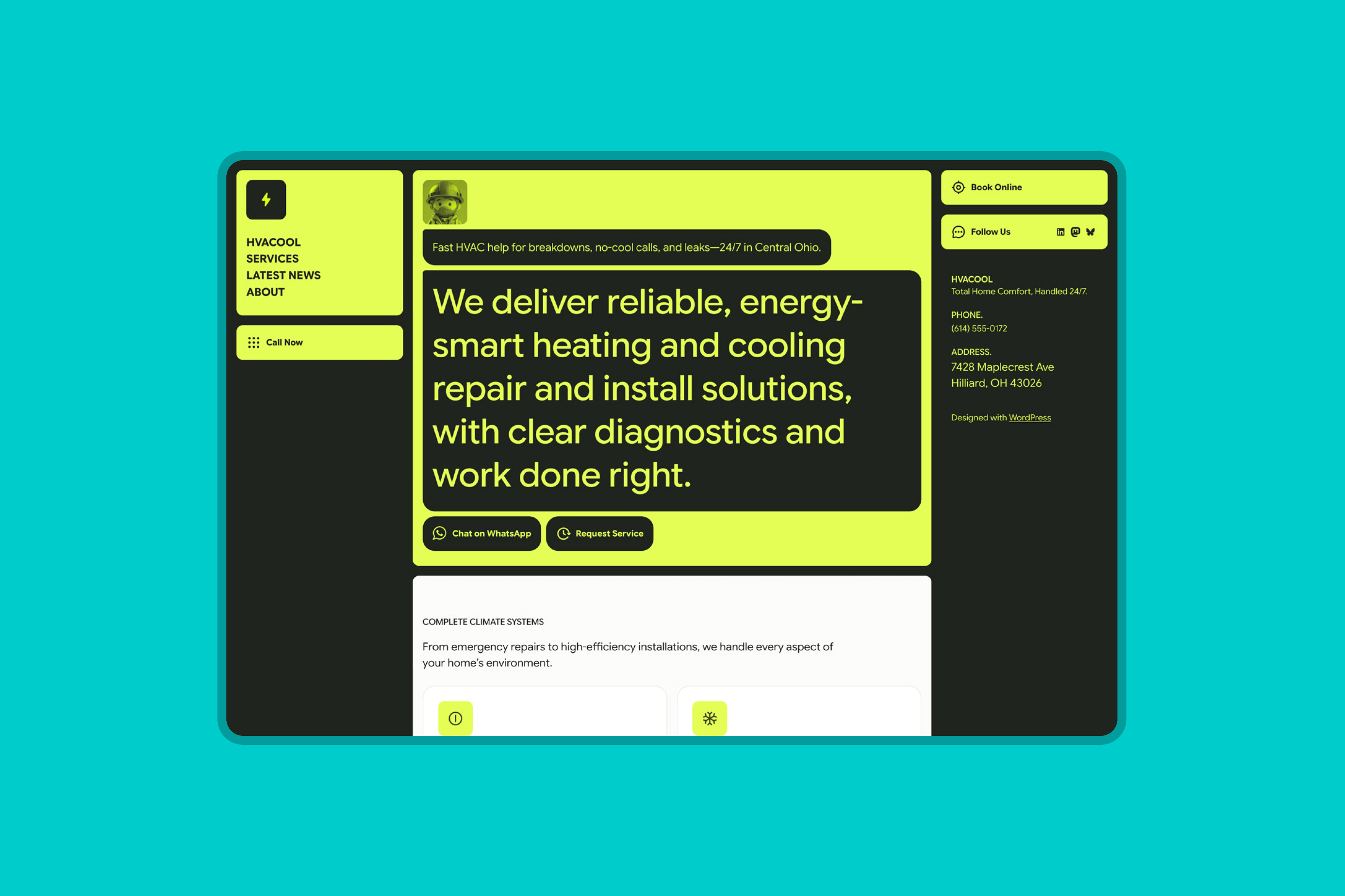
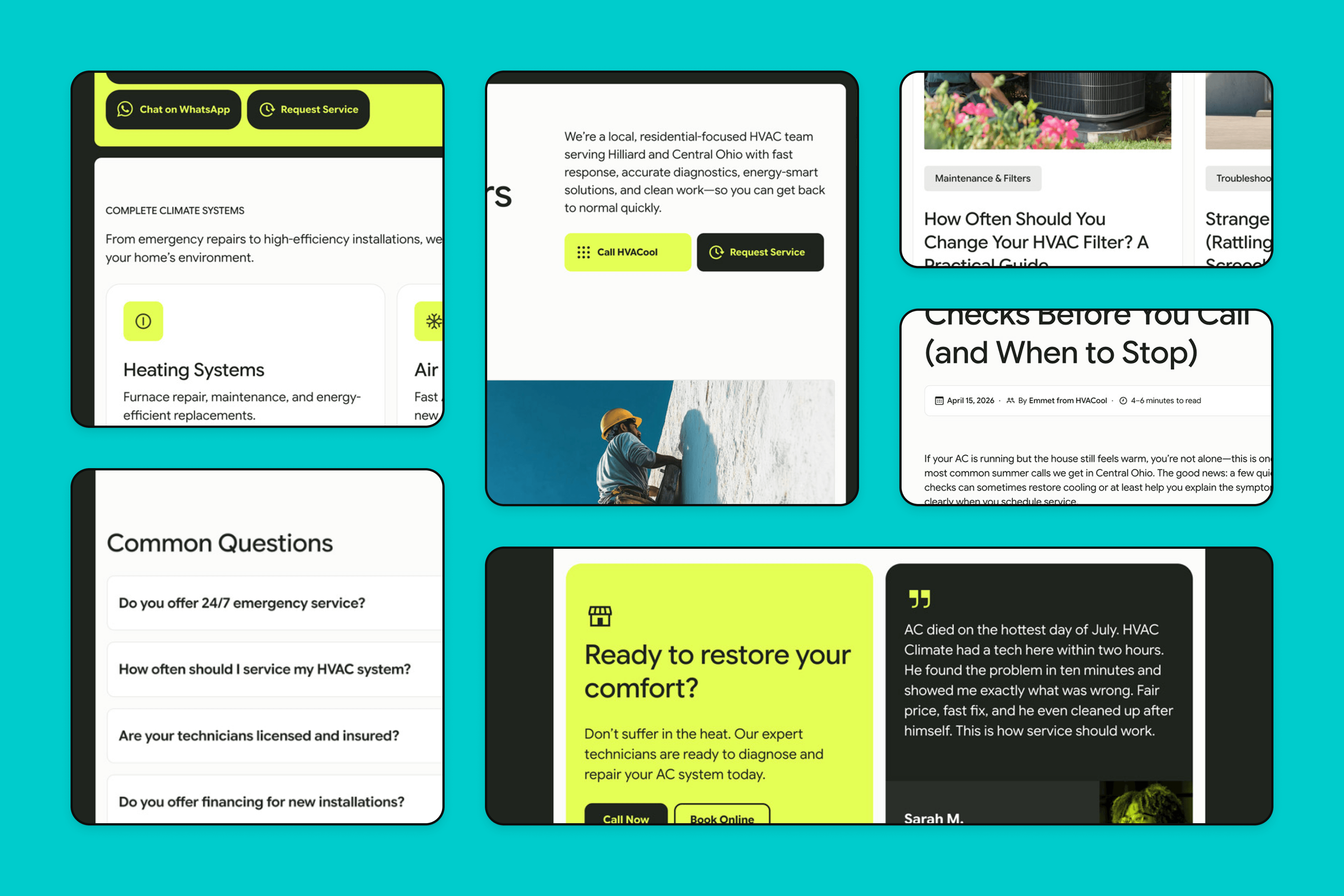
Fixed columns, critical information first
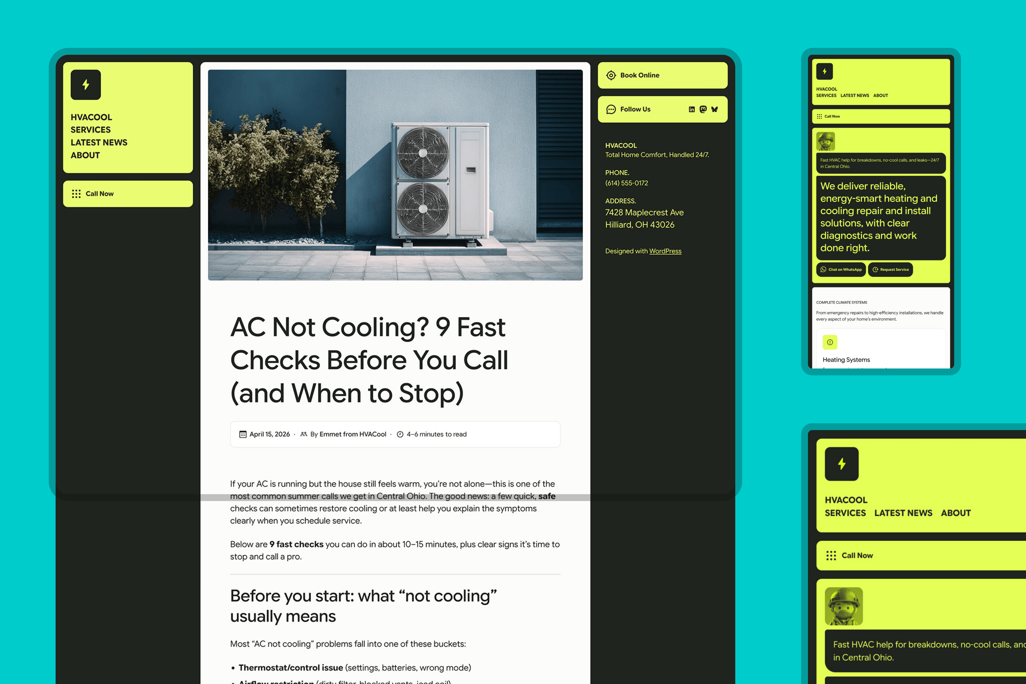
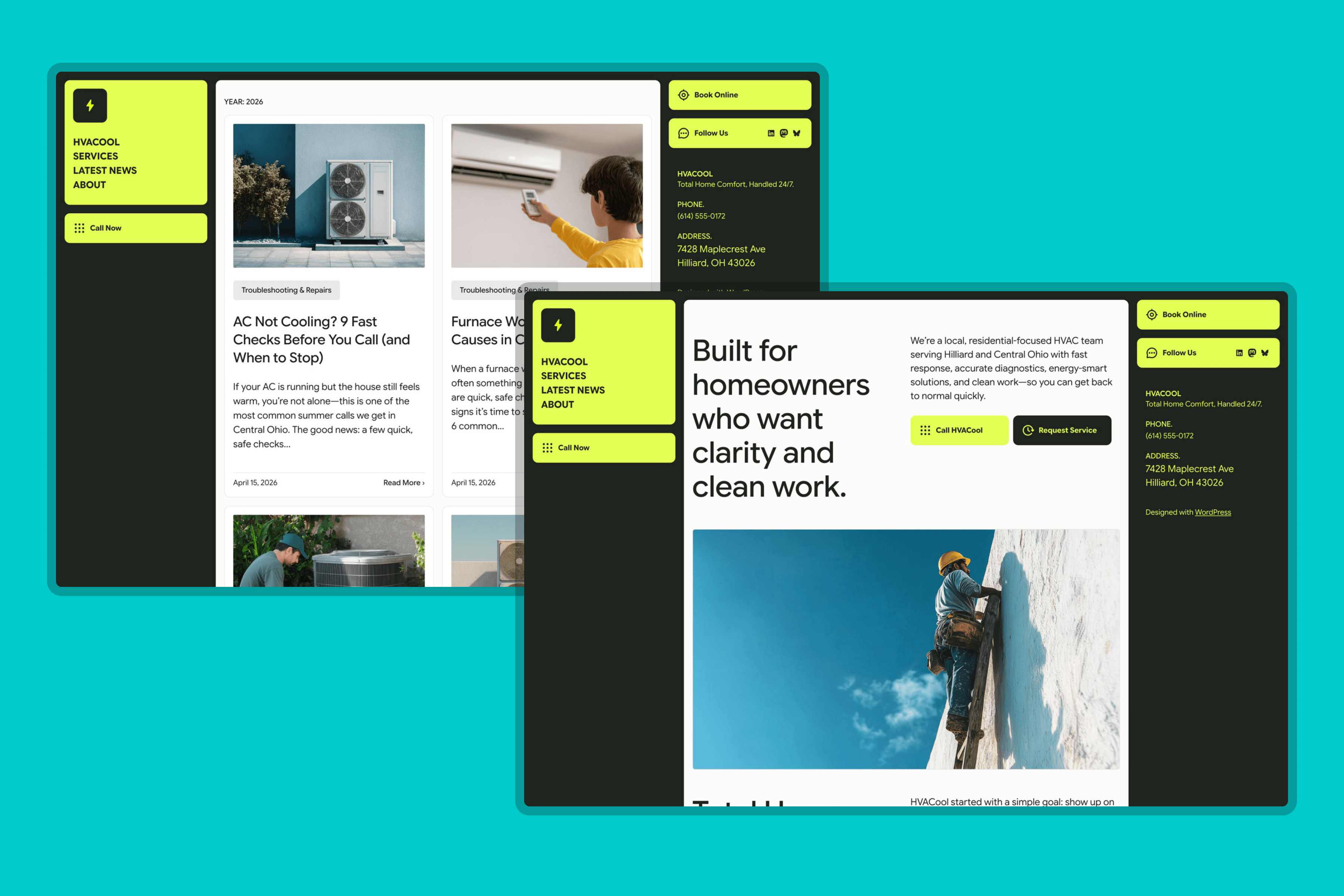
The three-column structure keeps the business identity (logo, navigation, CTA) locked in the left sidebar and contact details fixed on the right, so the information a customer needs in a crisis—phone number, booking link, address—is always visible, no matter where they are on the page. The center column (60% width) handles content such as headlines, service descriptions, and news.
Round corners and a one-color accent to ‘rule them all’
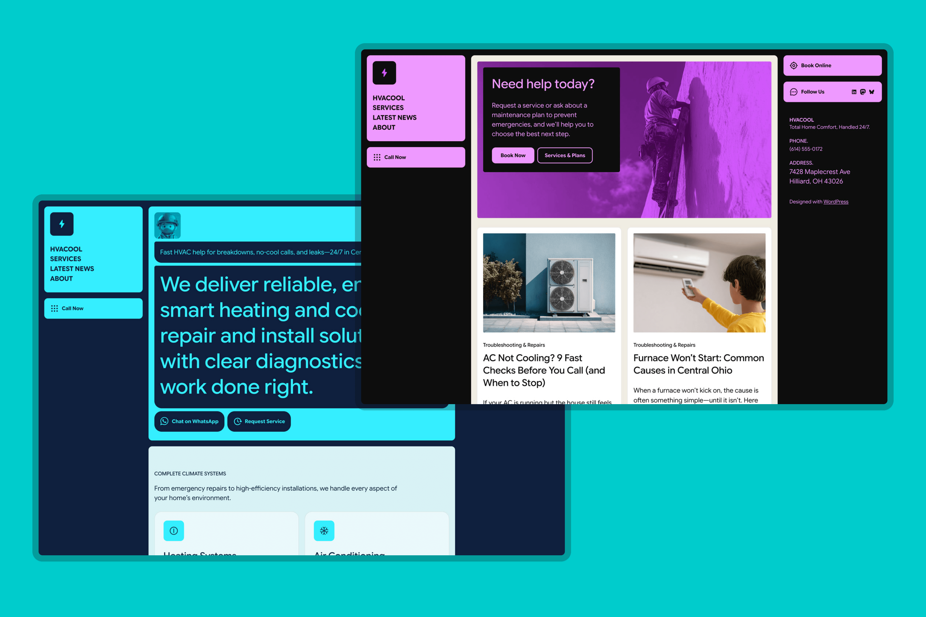
The palette runs on deliberate tension: near-black backgrounds, off-white content surfaces, and a single acid green reserved for elements that demand immediate attention—the logo block, primary CTAs, icon badges, and hover states. Four palette variations ship with the theme, pairing the accent with warmer, cooler, and neutral base tones to shift the personality.
Typography is handled entirely by the Google Sans family—Display (72pt) for headings and Text (24pt) for body—to keep the system cohesive and performance-conscious, using a single family across all weights and contexts.
Motion with purpose, and a clean technical foundation
Lightweight animations and hover effects add character without competing with the content. These details reinforce the theme’s readiness-to-act quality by signaling interactivity at the right moments. The custom button styles are registered in theme.json and exposed via functions.php, making them available in the native button UI without requiring custom CSS from the site owner. Overall, the CSS is lean, organized, and well-commented.
Animate your hero section
HVACool’s front page greets visitors with a short animated sequence: the technician avatar pops in, the speech bubbles type themselves out, and the call-to-action buttons fade in to finish. You can reuse these animations on your own blocks — no code required.
How it works
The animations are driven by three CSS classes. Add them to any block on the front page via Block settings → Advanced → Additional CSS class(es):
anim-avatar— a playful scale-and-bounce pop. Used on the technician image, but works on any image block.anim-pill— the signature text reveal. If the block’s first text element is a paragraph, it types out character by character. If it’s a heading, it slides up and fades in instead — typing a multi-line heading would reserve its full height upfront and leave an empty bubble on screen for a beat.anim-buttons— a subtle fade-up for your call-to-action row, timed to enter after the pills finish.
The sequence always runs in order: avatar pop → each anim-pill block animates one after another (in page order) → buttons fade in. It starts when the section scrolls into view.
Good to know
- Front page only. The script that drives the sequence loads only on the front page. Adding the classes to blocks on other pages won’t animate them — by design, to keep the rest of the site fast. (Developers can lift the
is_front_page()guard infunctions.phpto change this.) - Accessibility built in. Visitors with “reduce motion” enabled in their system settings see the content immediately, with no animation. Visitors without JavaScript see everything too — nothing stays hidden.
- Mix and match. You can use one, two, or all three classes. Multiple
anim-pillblocks are fine; they’ll animate in the order they appear on the page.
 ThemeShaper