A bold, editorial theme for design journals—built around a strict modular grid, high-contrast typography, and primary-color accents inspired by the concrete geometry of the De Stijl movement.
Designed for “dispatch” style publishing, it prioritizes structure over decoration: clear hierarchy, crisp rule lines, and archive-first layouts that make posts feel finished even with minimal imagery. It also includes a lightweight portfolio pattern for showcasing selected works with style.
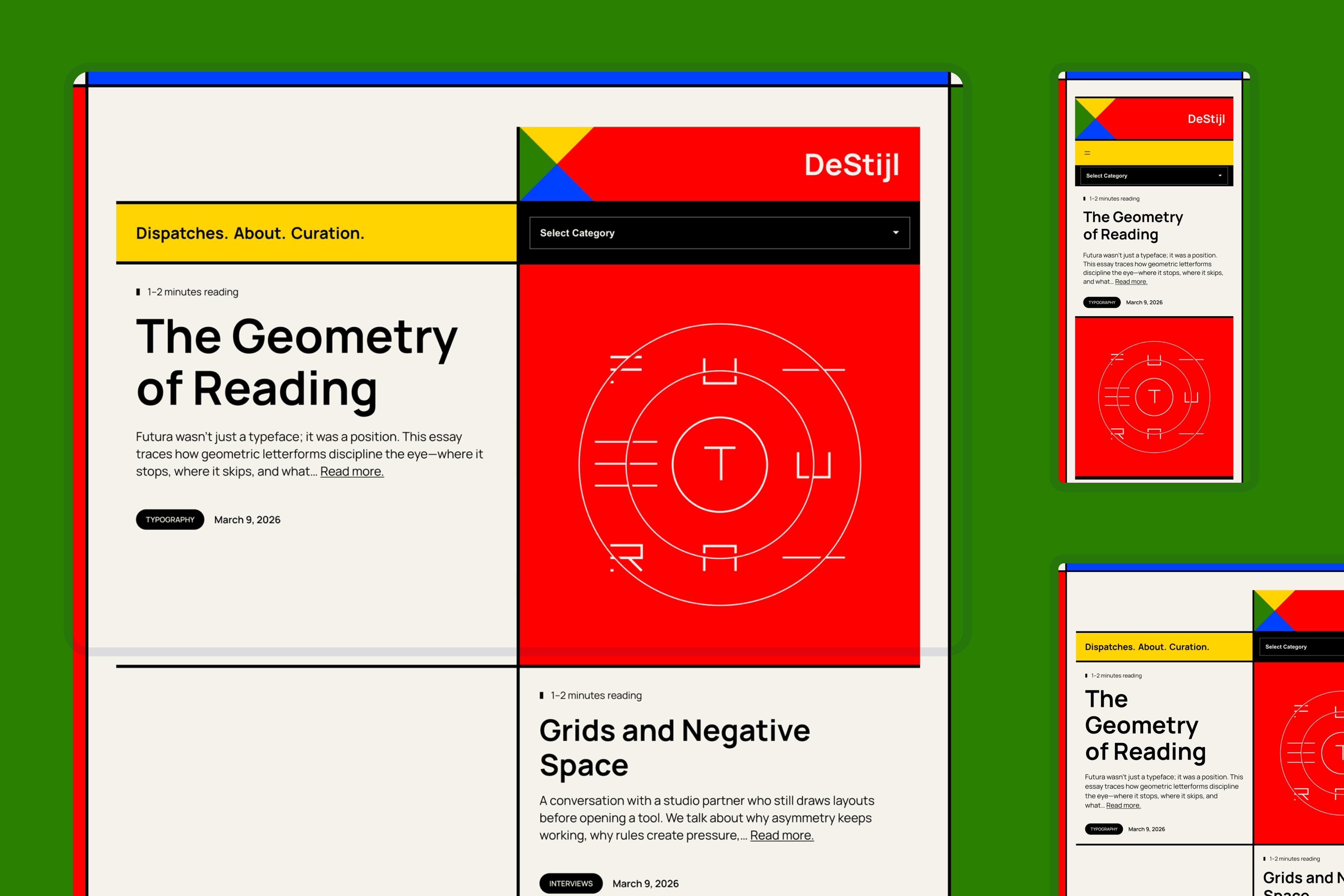
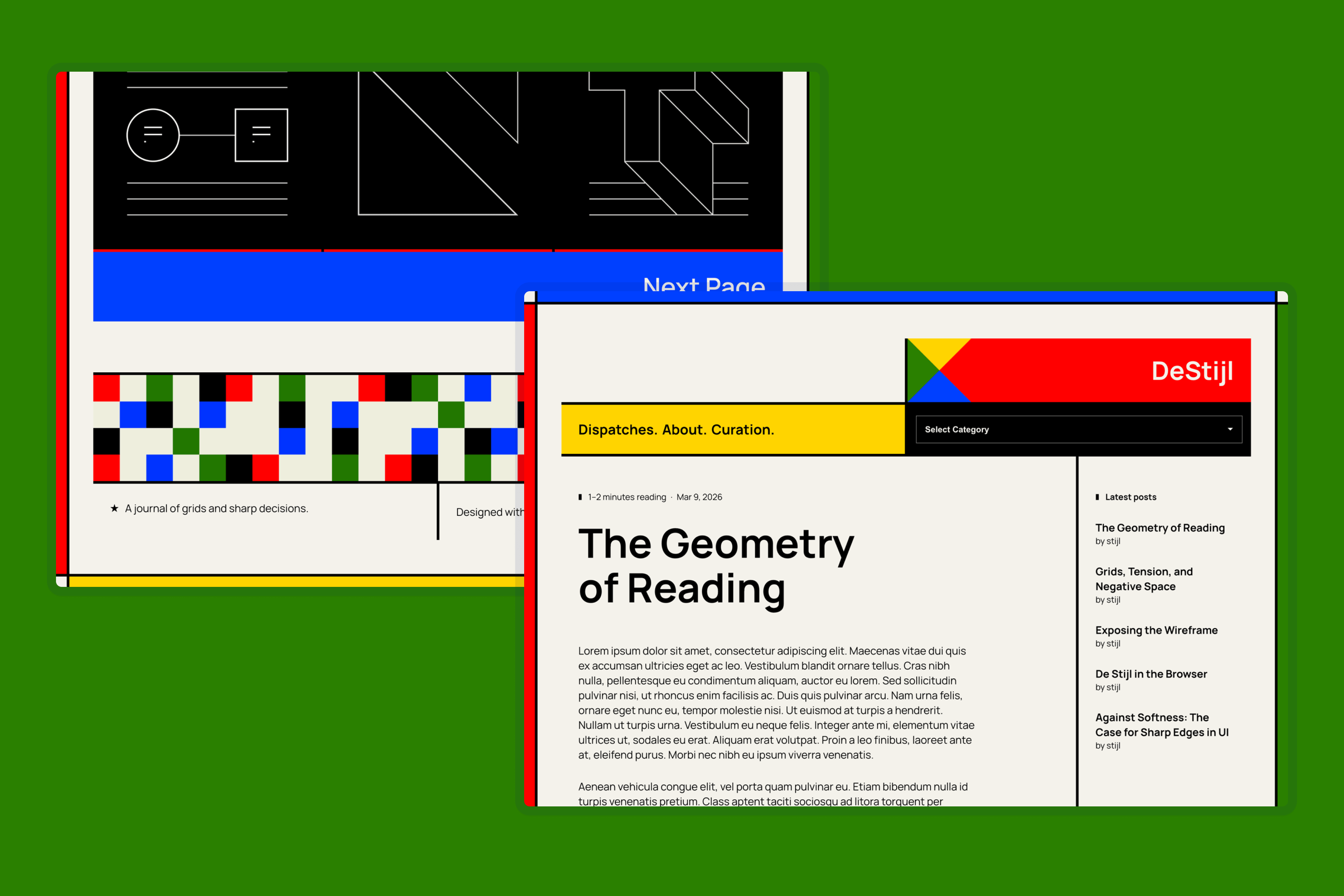
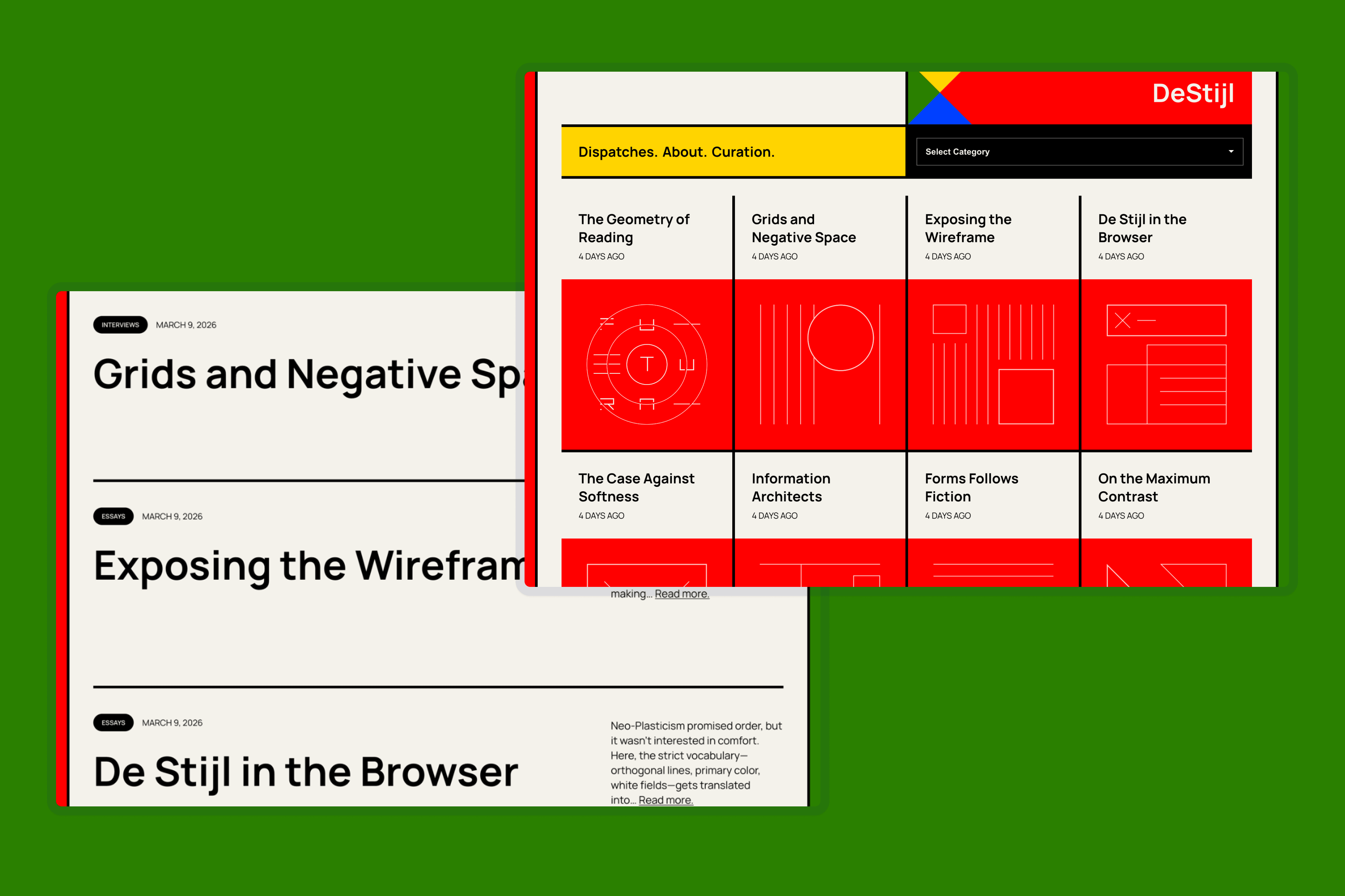
De Stijl structure, translated for the web
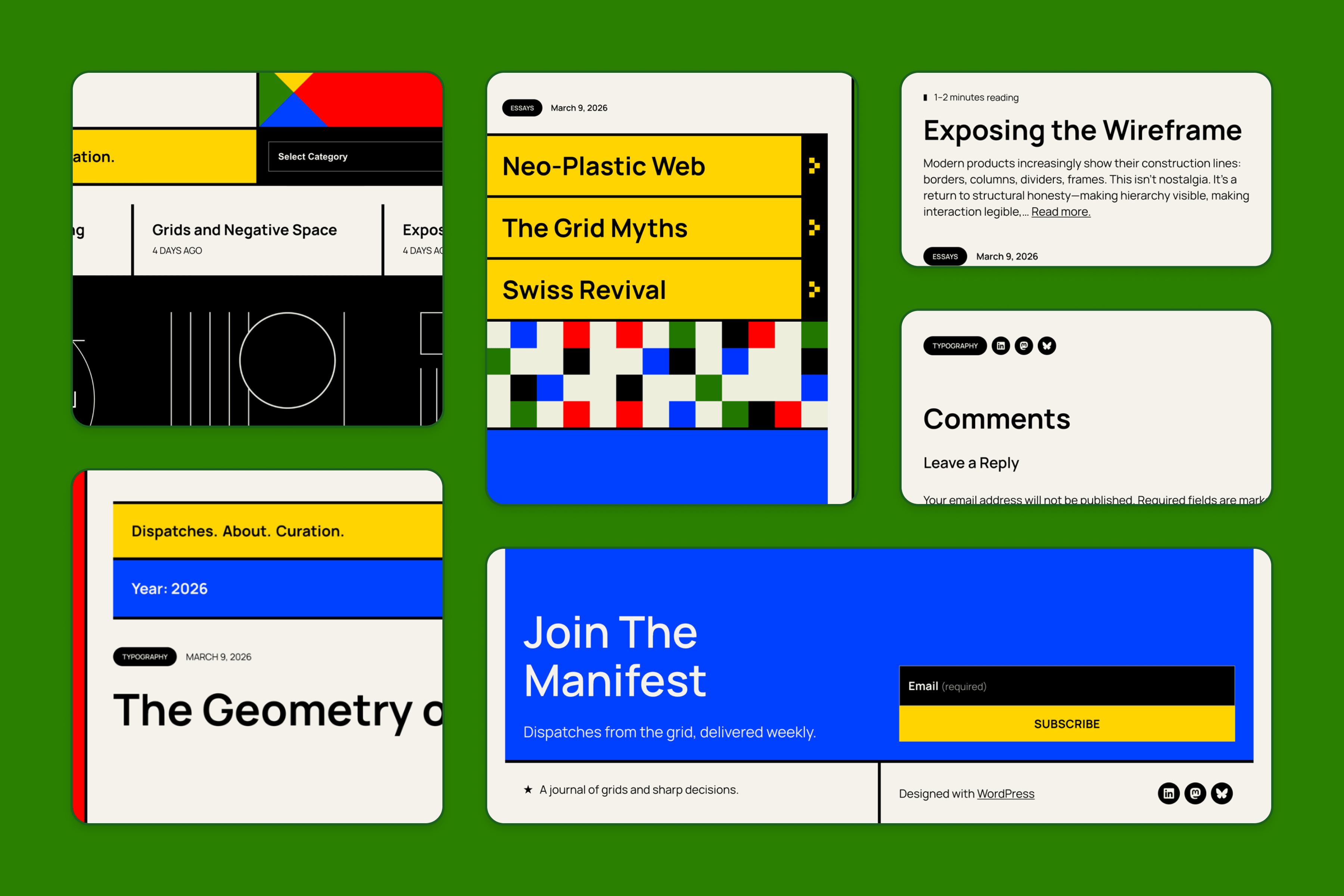
A theme that treats the grid as the interface, with sharp edges and primary-color blocks, creates a layout that feels intentional before a single image loads. Navigation, dividers, and pagination are all part of a system designed for quick scanning. A key structural choice is the Category Dropdown positioned next to the navigation, giving readers detailed control over the archive without leaving the page—displaying the content structure as much as the grid.
Typography-led publishing with an archive mindset
For typography, the theme uses Manrope as its workhorse typeface—a modern geometric sans designed for clarity across UI and long-form reading. A second style variation swaps in Involve for a rounder, movement-adjacent voice. The choice is more appropriate in tone to the modernist period, but intentionally less “clinical” than Manrope for extended reading.
The color palette stays mostly neutral, with red/blue/yellow reserved for signals: section headers, category emphasis, and key actions. The result is high contrast without visual noise; bold when it needs to be, calm everywhere else.
A gallery grid for selected works
The theme also features a strict, gallery-style grid for displaying selected works as objects rather than text. Pieces are shown as bold tiles with clear labels and generous negative space—encouraging series-style viewing and quick scanning. It’s built to feel curated and finished, so a small collection of work appears intentional and whole without the need for complexity.
 ThemeShaper