
Global Styles is a new mechanism for a theme to define a site’s styles. An important goal of Global Styles is to make it easier for users to change how their site looks without having to know or write any CSS. These theme styles are defined via a json configuration file. Importantly, it opens the way for users to modify those settings themselves in the Global Style Editor.
Here you can find an empty theme JSON file to check out. There’s a “Global” object with a “settings” block and a “styles” block. You’ll find plenty of details about this JSON file here in the Gutenberg docs. Remember, work is ongoing so those details will change and grow. Q has built this very handy tool to get started with some generated JSON and get a head start on building your own theme.
Let’s take a look at some of those settings.
Global Settings
An important thing that we define at the global level is the palette of a theme. These are the colors that will be used throughout.
This will be in our settings portion of the JSON in the global.settings.color.palette collection and looks like this.
{“global”: { “settings”: {
	"color": {
		"palette": [
			{
				"slug": "blue",
				"color": "#0000FF",
				"name": "Blue"
			}
			…
With that defined there’s now a CSS variable –wp–preset–color–blue to be used throughout the theme. And since it’s defined at the :root level you can use it throughout your theme’s JSON and CSS.
This portion of the docs outlines the details of how that gets translated from JSON objects to CSS variable names. It follows the –wp-preset–{category}–{slug} pattern.
And all of the colors in that palette are now at the disposal of users to apply across any block that supports colors.
A quick note regarding naming conventions:
It creates an easier time for users when switching themes if the palette names are descriptive of what they ARE rather than what they are FOR. For instance “light-blue” or “canary-yellow” is more helpful than “secondary” or “accent”.
This is because when users switch themes, if a palette color that they have chosen has the same name in the new theme then that palette color will still be used. So if they picked a blue color, but it was labeled “secondary” and the new theme has a “secondary” color that is actually orange then suddenly something is orange that used to be blue and the poor user is very confused as to why.
Whereas if they choose a color labeled “light-blue” and switch to another theme where there is also a “light-blue” palette color (even if it is a slightly different shade of blue) then their choice of color holds and is less likely to be confused about the color of their elements.
This also holds true for font size names: ‘small’ and ‘normal’ are a cleaner choice than ‘primary’ and ‘secondary’.
Global Styles
With this palette in hand you can associate those colors to your site at the global level or per-block to get the theme styled right. Looking toward the styles portion of the configuration we can adjust what colors we use for things like the background. This setting for global.styles.color.background shows us how to leverage the color value we just created:
{“global”:{
	"styles": {
	    	"color": {
			"background": "var(--wp--preset--color--blue)"
		}
	}
	…
There are a lot more important things like typography that we can use these global styles and settings for (and even some custom values) and I’ll mention more below. But for now let’s go a little deeper…
Block Styles
Now we can get extra fancy. The above showed us settings at a global level. But using JSON we can now also assign these styles to blocks, simply by targeting the block’s ‘context’ instead of ‘global’ context:
…
“core/heading/h1”:{
	"styles": {
	    	"color": {
			"background": "var(--wp--preset--color--blue)"
		}
	}
	…
These values are rendered into CSS which applies that style to every h1 element.
h1 {
	background-color: var(--wp--preset--color--blue);
}
Though for some blocks these values are rendered into a class which is applied to blocks of that type. For instance, Gutenberg turns the configuration for a “core/site-title” into:
.wp-block-site-title {
	background-color: var(--wp--preset--color--blue);
}
And should a user want to customize that further…
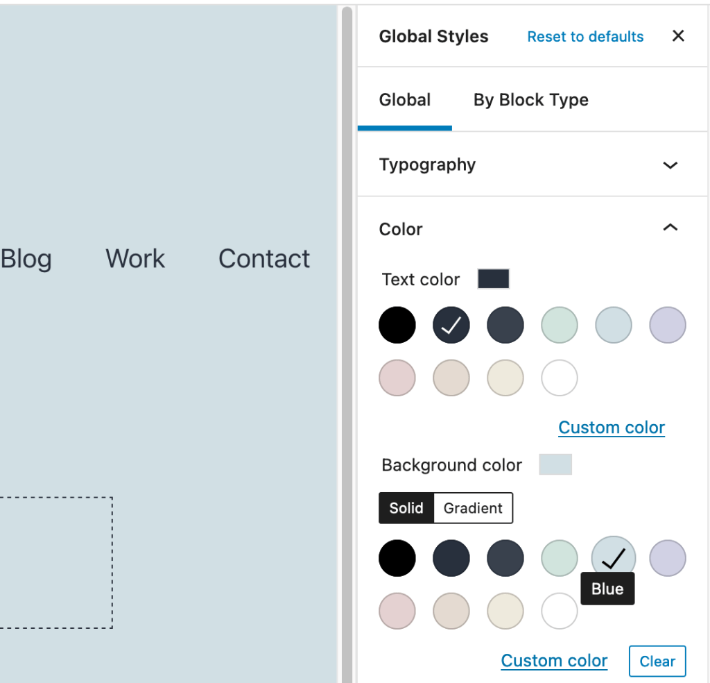
User Block Styles with the Global Style Editor
And finally the Global Style Editor in the Full Site Editor can be used to customize aspects of a block at the site level. These values will supersede whatever is set in the theme’s JSON.
Here a user is changing the Site Title’s background style via the Global Styles Editor.

Typography
Just like colors, defining typography for a theme has moved from the realm of PHP to some simple configuration.
Adding some objects to global.settings.typography.fontSizes looks like this:
{“global”: { “settings”: { “typography”: {
	"fontSizes": [
		{
			"slug": "small",
			"size": "15px",
			"name": "Small"
		},
	]
	…
And just like colors, defining the font sizes for the theme in this way will give users access to these same values in the editor. This makes it easier for them to reuse the sizes the theme designer defines.

Font families can be defined in the same way:
{“global”: { “settings”: { “typography”: {
	"fontFamilies": [
		{
			"fontFamily": "sans-serif",
			"slug": "noserifsplease",
			"name": "Sans"
		}
	]
	…
Of course for non-system fonts you’ll also need to load the fonts. This can still be done in the function.php file with wp_enqueue_style and should seem familiar.
…
wp_enqueue_style( 'mytheme-fonts', 'https://url/for/font-face/definitions' , array(), null );
…
Or include the font face in your style.css
@font-face {
  font-family: 'Epilogue';
  font-style: normal;
  font-weight: 300;
  src: url(https://url/for/font-file.woff) format('woff');
}
Now that the font is loaded it can be used in the theme.json file:
{“global”: { “settings”: { “typography”: {
	"fontFamilies": [
		{
			"fontFamily": "\”Epilogue\”, sans-serif",
			"slug": "epilogue",
			"name": "Epilogue"
		}
	]
	…
And now these font values can be leveraged either at the global level or at the block level in your configuration, crafting the look and style of the theme:
{“global”:{
	"styles": {
		"typography": {
			"fontSize": "var(--wp--preset--font-size--normal)"
			“fontFamily”: “Epilogue”
			…

…
“core/site-title”:{
	"styles": {
		"typography": {
			"fontSize": "var(--wp--preset--font-size--normal)"
			“fontFamily”: “Epilogue”
			…
CSS
Not all styles can be expressed in the theme JSON. In time we hope that all common styles will be available, but there will always be some things that will only live in CSS (like animations).
The theme’s style.css file will continue to be available as a way to express the style of a block-based theme. Blocks can continue to be styled in CSS with classes. But now you can use all of the swatches defined in your theme JSON throughout. You can even define custom values like a global vertical spacer value.
Theme JSON
{“global”: { “settings”: { “custom”: {
	“spacing”: {
		“vertical”: “20px”
		…
Theme CSS
.wp-block-of-some-kind {
padding-top: var(--wp--custom--spacing--vertical);
…Buy Why?
Defining styles in this way has some important advantages.
JSON configuration is more accessible than writing PHP code and CSS. There’s less to understand, less to type and less to potentially mess up. This doesn’t “re-invent CSS as JSON” and the concepts of CSS certainly don’t go away because of this new tooling. Nor will PHP. But key concepts present in every WordPress theme can be expressed simply and in ways that can be leveraged in more ways than CSS alone. This will make Theme development a simpler and faster process.
But perhaps one of the most important aspects of this new Global Styles system is the power it puts in the hands of people USING a Theme. By using a Theme as a starting place and providing the tools to tweak things to suit their needs, without custom CSS and in a visually clear way is incredibly powerful. This makes ALL themes leveraging these tools immediately more powerful.
 ThemeShaper